+ - 0:00:00
Notes for current slide
Notes for next slide

Interactive data visualization with R

Carson Sievert, PhD
CSL Behring

May 4th, 2020

Slides: https://bit.ly/csl-training

1 / 69

Thank you for responding (and attending!)

2 / 69

The clear winner

3 / 69

Can't have advanced without some basics!

4 / 69

Along the way...

5 / 69

About me

6 / 69

Data science workflow

7 / 69

R is designed for exploring data!


R (especially the tidyverse) is designed reduce friction during this stage

8 / 69

Data viz requires data wrangling!


Iteration becomes seamless if you embrace ggplot2 (viz), dplyr (transform), tidyr (tidy), etc.

9 / 69

Reduce EDA friction and easily inject interactivity


Thanks to plotly, shiny, etc, it's easy to inject interactivity into (static) ggplot2 plots

10 / 69

ggplot2: a grammar of graphics

  • Any graph can be broken down into the following components:

    1. Data
    2. Mappings (i.e. variables to visualize)
    3. Geoms (e.g., points, lines, rectangles, etc)
      • Statistical aggregation
      • Positional adjustment
    4. Scales
    5. Facets (i.e., small multiples)
    6. Coordinates
    7. Theme (i.e., styling)
  • As a ggplot2 user, all you really need to provide is 1, 2, and 3. Everything thing else has smart defaults.

  • Helps minimize the cognitive burden, especially during the iteration phase.

11 / 69

Let's start with some toy data on cars

R comes with some useful toy datasets (e.g., mtcars):

#> # A tibble: 32 x 5
#> name wt mpg am cyl
#> <chr> <dbl> <dbl> <chr> <dbl>
#> 1 Mazda RX4 2.62 21 manual 6
#> 2 Mazda RX4 Wag 2.88 21 manual 6
#> 3 Datsun 710 2.32 22.8 manual 4
#> 4 Hornet 4 Drive 3.22 21.4 automatic 6
#> 5 Hornet Sportabout 3.44 18.7 automatic 8
#> 6 Valiant 3.46 18.1 automatic 6
#> 7 Duster 360 3.57 14.3 automatic 8
#> 8 Merc 240D 3.19 24.4 automatic 4
#> 9 Merc 230 3.15 22.8 automatic 4
#> 10 Merc 280 3.44 19.2 automatic 6
#> # … with 22 more rows
12 / 69

Focus on 3 key aspects: Data, Mappings, and Geoms.

library(ggplot2)
ggplot(mtcars) +
  geom_point(mapping = aes(x = wt, y = mpg))

13 / 69

Focus on 3 key aspects: Data, Mappings, and Geoms.

library(ggplot2)
ggplot(mtcars) +
  geom_point(mapping = aes(x = wt, y = mpg, color = am))

14 / 69

Focus on 3 key aspects: Data, Mappings, and Geoms.

library(ggplot2)
ggplot(mtcars) +
  geom_point(mapping = aes(x = wt, y = mpg, color = am))

15 / 69

Focus on 3 key aspects: Data, Mappings, and Geoms.

library(ggplot2)
ggplot(mtcars) +
  geom_point(mapping = aes(x = wt, y = mpg, color = am))

16 / 69

Mappings map data to a visual properties according to a Scale

library(ggplot2)
ggplot(mtcars) +
  geom_point(aes(x = wt, y = mpg, color = am)) +
  scale_color_manual("Transmission", values = c(automatic="blue", manual="red"))

17 / 69

Tip: use color-blind safe palettes (e.g., colorbrewer or Okabe Ito)

library(ggplot2)
ggplot(mtcars) +
  geom_point(aes(x = wt, y = mpg, color = am)) +
  scale_color_brewer("Transmission", type = "qual")

18 / 69

Tip: use multiple visual properties to help distinguish groups

library(ggplot2)
ggplot(mtcars) +
  geom_point(mapping = aes(x = wt, y = mpg, color = am, shape = am))

19 / 69

Outside aes(): set property without scaling

library(ggplot2)
ggplot(mtcars) +
  geom_point(mapping = aes(x = wt, y = mpg, color = am, shape = am), size = 4)

20 / 69

Inside aes(): set property with scaling

library(ggplot2)
ggplot(mtcars) +
  geom_point(mapping = aes(x = wt, y = mpg, color = am, shape = am, size = hp))

21 / 69

Geoms (aka Layers) inherit Data and Mappings from ggplot()

library(ggplot2)
ggplot(mtcars, aes(x = wt, y = mpg, color = am)) +
  geom_point() +
  geom_smooth()

22 / 69

Geoms (aka Layers) inherit Data and Mappings from ggplot()

library(ggplot2)
ggplot(mtcars, aes(x = wt, y = mpg, color = am)) +
  geom_point(aes(shape = am), size = 3) +
  geom_smooth(aes(linetype = am))

23 / 69

Geoms (aka Layers) are parameterized by more than visuals (e.g., Statistics)

library(ggplot2)
ggplot(mtcars, aes(x = wt, y = mpg, color = am)) +
  geom_point(aes(shape = am), size = 3) +
  geom_smooth(aes(linetype = am), method = "lm", se = FALSE)

24 / 69

Use Facets to see how patterns change across sub-groups

library(ggplot2)
ggplot(mtcars, aes(x = wt, y = mpg, color = am)) +
  geom_point(aes(shape = am), size = 3) +
  geom_smooth(aes(linetype = am), method = "lm", se = FALSE) +
  facet_wrap(~cyl)

25 / 69

Tip: format the data value for presentation

library(ggplot2)
ggplot(mtcars, aes(x = wt, y = mpg, color = am)) +
  geom_point(aes(shape = am), size = 3) +
  geom_smooth(aes(linetype = am), method = "lm", se = FALSE) +
  facet_wrap(~paste("Cylinders:", cyl))

26 / 69

Tip: most important comparisons within panel

library(ggplot2)
ggplot(mtcars, aes(x = mpg, color = am)) +
  geom_density() +
  facet_wrap(~paste("Cylinders:", cyl))

27 / 69

Much easier to compare cylinders this way!

library(ggplot2)
ggplot(mtcars, aes(x = mpg, color = factor(cyl))) +
  geom_density() +
  facet_wrap(~am)

28 / 69

ggplotly(): Make ggplot2 interactive and web-based!

library(plotly)
ggplotly() # picks up on the previously printed ggplot
29 / 69

Works with nearly any ggplot2 geom

library(plotly)
p <- ggplot(mtcars, aes(x = wt, y = mpg, color = am)) +
geom_point() +
geom_smooth(method = "lm", se = FALSE)
ggplotly(p)
30 / 69

Customized ggplotly() tooltips (learn more)

library(plotly)
p <- ggplot(mtcars, aes(x = wt, y = mpg, color = am)) +
  geom_point(aes(text = name)) +
  geom_smooth(method = "lm", se = FALSE)
ggplotly(p, tooltip = "text")

31 / 69

Use plotly's API to customize further!

last_plot() %>%
style(hoverlabel = list(bgcolor = "white"), hoverinfo = "x+y+text") %>%
layout(
xaxis = list(showspikes = TRUE),
yaxis = list(showspikes = TRUE)
)
32 / 69

Trouble with ggplotly()? Try plot_ly()!

plot_ly() is a more "direct" interface to the underlying plotly.js (JavaScript) library.

plot_ly(mtcars) %>%
add_markers(x = ~wt, y = ~mpg, color = ~am)

33 / 69

plot_ly(): also inspired by grammar of graphics

Focus on 3 key aspects: Data, Mappings, and Geoms.

plot_ly(mtcars) %>%
  add_markers(x = ~wt, y = ~mpg, color = ~am)

34 / 69

plot_ly(): embraces the pipe

To add to (or modify) a plotly object, use %>% instead of +

plot_ly(mtcars) %>%
  add_markers(x = ~wt, y = ~mpg, color = ~am)

35 / 69

Good practice: pre-attentive features

Use multiple perceptual channels (i.e., color, symbol, linetype) to distinguish groups.

plot_ly(mtcars) %>%
  add_markers(x = ~wt, y = ~mpg, color = ~am, symbol = ~am)

36 / 69

Tip: Scale up with toWebGL() (also works with ggplotly())

plot_ly(diamonds) %>%
  add_markers(x = ~carat, y = ~price) %>%
  toWebGL()

toWebGL() changes rendering to HTML Canvas instead of SVG. The difference is similar to using png() instead of pdf() for static plots (lower-quality, but way more scalable).

37 / 69

Tip: Combat overplotting with alpha blending

plot_ly(diamonds) %>%
  add_markers(x = ~carat, y = ~price, alpha = 0.1) %>%
  toWebGL()

38 / 69

Tip: Combat overplotting with summaries

plot_ly(diamonds) %>%
  add_histogram2d(x = ~carat, y = ~price)

For "heavy-tailed" distributions, it can be useful to perform the summary (e.g., log counts) in R yourself. For more on this, see https://plotly-r.com/frequencies-2d

39 / 69

Your turn

Go to our RStudio Cloud project, and open the exercise.R script. Walk through the code by pressing Ctrl+Enter (Cmd+Enter on Mac) and answer the questions.

Feel free to send me a message through the Teams chat if you have questions and/or you're finished.

10:00
40 / 69

plot_ly() demo

Go to our RStudio Cloud project, and open the cran-downloads.R script.

41 / 69

CRAN downloads

logs <- cranlogs::cran_downloads(
c("plotly", "leaflet", "ggvis", "networkD3", "rbokeh"),
from = Sys.Date() - 365,
to = Sys.Date()
)
logs
# A tibble: 1,830 x 3
date count package
<date> <dbl> <chr>
1 2019-04-21 2676 plotly
2 2019-04-22 4549 plotly
3 2019-04-23 5912 plotly
4 2019-04-24 5368 plotly
5 2019-04-25 5222 plotly
6 2019-04-26 4903 plotly
7 2019-04-27 3151 plotly
8 2019-04-28 2982 plotly
9 2019-04-29 4961 plotly
10 2019-04-30 5544 plotly
# … with 1,820 more rows
42 / 69

skimr for a first real look at the data

skimr::skim(logs)
── Data Summary ────────────────────────
Values
Name logs
Number of rows 1830
Number of columns 3
_______________________
── Variable type: character ───────────────────────────────────────────────────────────────
skim_variable n_missing complete_rate min max empty n_unique whitespace
1 package 0 1 5 9 0 5 0
── Variable type: Date ────────────────────────────────────────────────────────────────────
skim_variable n_missing complete_rate min max median n_unique
1 date 0 1 2019-04-21 2020-04-20 2019-10-20 366
── Variable type: numeric ─────────────────────────────────────────────────────────────────
skim_variable n_missing complete_rate mean sd p0 p25 p50 p75 p100 hist
1 count 0 1 1441. 1787. 0 211 573 2229 8690 ▇▂▁▁▁
43 / 69

These are daily downloads, which dip on weekends!

plot_ly(logs) %>%
add_lines(x = ~date, y = ~count, color = ~package)

44 / 69

Apply a weekly rolling average to see the trend

logs$weekly_avg <- zoo::rollapply(logs$count, 7, mean, fill = "extend")
plot_ly(logs) %>%
add_lines(x = ~date, y = ~weekly_avg, color = ~package)

45 / 69

Use log scale to more easily compare

plot_ly(logs) %>%
add_lines(x = ~date, y = ~weekly_avg, color = ~package) %>%
layout(yaxis = list(type = "log"), hovermode = "compare")

46 / 69

Which is better? Why?

subplot(shareX = TRUE, nrows = 2,
plot_ly(logs) %>% add_heatmap(x = ~date, y = ~package, z = ~weekly_avg),
plot_ly(logs) %>% add_lines(x = ~date, y = ~weekly_avg, color = ~package)
)

47 / 69

A guideline for encoding data with visuals

48 / 69

User studies have asked: which is larger? A or B? By how much?

These questions drive at least two influential papers:

This figure is from Data Visualization for Social Science (highly recommended!) in reference to Bostock and Heer.

49 / 69

Position is best, especially along common scale and baseline

50 / 69

Which is better if we increase the number of packages?

51 / 69

All my installed.packages()...

logz %>%
plot_ly(x = ~date, y = ~weekly_avg) %>%
group_by(package) %>%
add_lines(alpha = 0.3)

Helpful for discovering "surprising" or "unusual" things, but not useful for seeing overall structure

52 / 69

Query/highlight the interesting packages

logz %>%
highlight_key(~package) %>%
plot_ly(x = ~date, y = ~weekly_avg) %>%
group_by(package) %>%
add_lines(alpha=0.3)

53 / 69

Add dynamic brush color, dropdown, and persistence

logz %>%
highlight_key(~package) %>%
plot_ly(x = ~date, y = ~weekly_avg) %>%
group_by(package) %>%
add_lines(alpha=0.3) %>%
highlight(dynamic = TRUE, selectize = TRUE, persistent = TRUE)

54 / 69

heatmap: better at displaying overall structure

(Especially if we place "similar" packages near one another, which is easy thanks to heatmaply!)

55 / 69


                  Graphing 1,000 time series

                         ——————————

56 / 69


                  Graphing 1,000 time series

                         ——————————

1,000,000 time series!

57 / 69

Visualization surprise, but don't scale well. Models scale well, but don't surprise

Hadley Wickham

58 / 69

Cognostics: associate each viz with numerical summaries

Imagine having many panels of scatterplots to sift through. If we attach numerical summaries to each (e.g., slope, intercept, etc), we could use that to inform which panels to view

59 / 69

Cognostics: associate each viz with numerical summaries

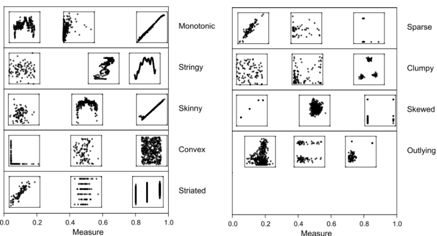
These are nine scagnostics (scatterplot-cognostics) measures from (Wilkinson and Wills, 2008). Same concept can be applied to time series (see tsfeatures package).

60 / 69

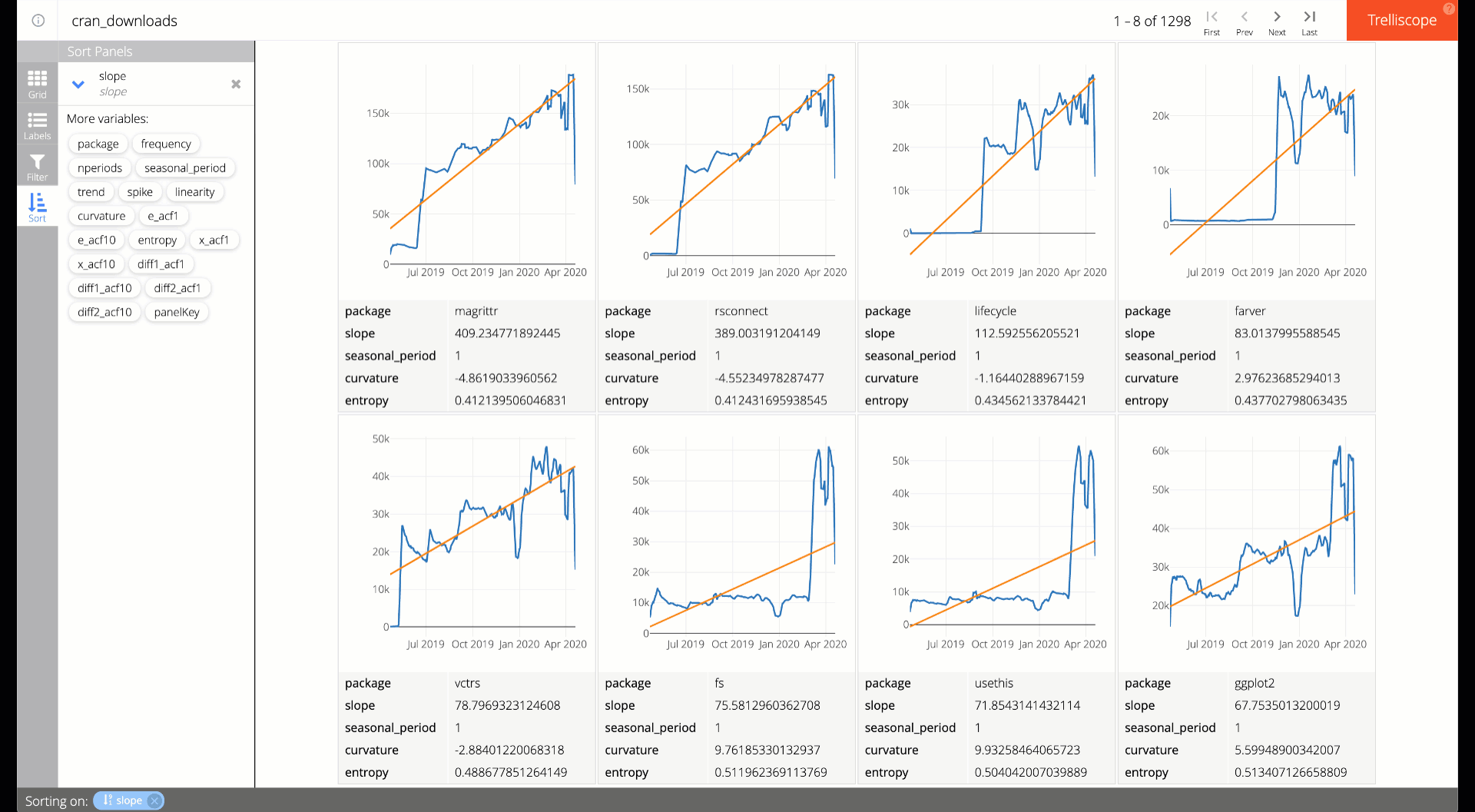
trelliscopejs: use cognostics to guide your exploration

61 / 69

A quick and easy trelliscope

library(trelliscopejs)
library(plotly)
ggplot(logz) +
geom_line(aes(date, weekly_avg)) +
facet_trelliscope(~package, as_plotly = TRUE)
  • facet_trelliscope() makes it super easy to work around the "too many panels" issue of facet_wrap().

  • This automatically computes some sensible cognostics (i.e., mean, median, variance, etc).

  • See here to learn how to customize the cognostics (and graphs).

  • See here for how I implemented the previous slide.

62 / 69

Your turn

  • Open and run the trelliscope.R script on RStudio Cloud.

  • Sort the panels (i.e., countries) by highest/lowest mean life expectancy.

  • Think of how trelliscopejs might be useful for exploring your own data project.

  • Try to implement your idea, either on Cloud or locally:

    • For Cloud, note there is a button to upload data in the File navigator
    • For local, install trelliscopejs with install.packages("trelliscopejs")
15:00
63 / 69

Visualization surprise, but don't scale well. Models scale well, but don't surprise

Hadley Wickham

Statistical graphics perspective on "big data viz".

64 / 69

Overview first, then zoom and filter, then details on demand

Ben Shneiderman

Information visualization perspective on "big data viz".

65 / 69

Idea: Use biplots to get an overview of the feature space

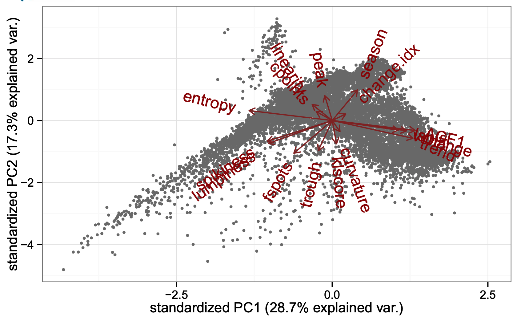
Image from Rob Hyndman's lecture on "Visualisation of big time series data"

66 / 69

Link overview with the raw data


  • If you're curious, the implementation is here, but we'll come back to the underlying linking techniques.
67 / 69

Similar idea, looking at foot traffic at train stations

See more about this data and analysis https://github.com/cpsievert/pedestrians

68 / 69

Thanks for attending (see you Friday)!

Before Friday, please read:

Want more ggplot2 and plotly?

69 / 69

Thank you for responding (and attending!)

2 / 69
Paused

Help

Keyboard shortcuts

, , Pg Up, k Go to previous slide
, , Pg Dn, Space, j Go to next slide
Home Go to first slide
End Go to last slide
Number + Return Go to specific slide
b / m / f Toggle blackout / mirrored / fullscreen mode
c Clone slideshow
p Toggle presenter mode
t Restart the presentation timer
?, h Toggle this help
Esc Back to slideshow